Music magazine evaluation slideshow
View more presentations from HannahFSG.
 I progressed on the research and planning by asking more potential readers, so I had more results to evaluate with. I also then, when creating my magazine, I planned the content according to their answers and produced a magazine that the target audience had specifically asked for not what I felt was best.
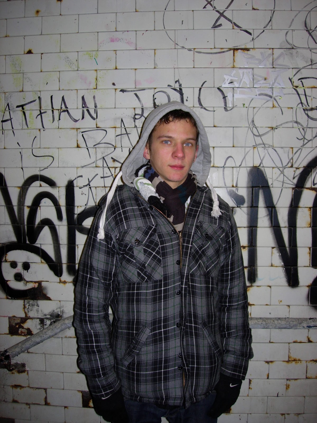
 The technology that I predominantly used was Photoshop; I used this to edit the images that I took. Some of the images that I took were too dark so by researching and asking others how to use Photoshop I managed to lighten the pictures. I also learnt how to cut out the person neatly so that I could place him over the heading using the cut and blur tool. This allowed the person to look more 3D compared to the background; as though they were more in front of the magazine; the main focus. Placing the image over the masthead creates a meaning of the person being the most important element on the front cover.
 I also learnt how to use blogger as I had never learnt how to blog before. I learnt how to create new posts and insert pictures into them. Through trial and error I managed to follow some other people who had also took media. Using blogger allowed me to keep myself and others up to date with what I had done and allow feedback such as comments on what worked and did not with the magazine.
 IPC Media reaches to two thirds of the female population and 42% of UK men. It focuses on three core audiences: men, mass market women and upmarket women; they want to be a publisher for everyone.
  My magazine is for the genre unsigned Indie, so it links most with the magazine Kerrang which is published by Bauer they would have first hand experience in making magazines like this successful. This publisher produces over 50 magazines already; about 5 of these are music magazines. I have chosen this publisher because they are well established with that form of media and the magazines that they publish are successful. IPC Media is based mainly on women where as my magazine would be, for the majority, men. Future is for guitar enthusiasts so my magazine would not fit in with their style. Hearst gives off the image of being a more professional style of magazine, more focused on the older audience therefore my magazine would not fit in with their productions and maybe too much of a risk for them to produce.
 The target audience for my magazine would be teenagers both male and female, a slight bias more to males, who are interested in both the production and listening to the music. They would also play musical instruments for themselves as they are passionate about this shown by the main artist being an all rounder in terms of music e.g. playing the music instruments himself. This is also shown by the competition on the contents page where the prize is aimed for readers who record their own music. My target audience would also be open minded about being introduced into new genres of music, anything new that is being released. This is because the genre of my magazine is independent so therefore various genres of music would be conveyed in the magazine. They have an open mind about all different genres and are happy to listen to all kinds, not just the one. They would also like going to live shows as they like the atmosphere of the event and they like to hear the music live, not just through recordings. This is shown by the numerous references to tours and concerts. They also have an interest in the typical teenage TV shows such as Misfits and Skins; they also play the typical video games such as COD. This would be assumed by the typical teenage artist on the front cover suggesting that most of the readers would be typical teenagers.
 The magazine represents the artist as both a singer and a musician this is shown in the editor’s letter where it states that he composes, produces and writes all of his own music. This is then referred back to in the double page spread where he says that ‘These videos were just me singing and playing guitar’ showing that he is not just a singer but also plays the guitar. This represents that he likes to make his own music.
 Through their love of concerts the readers are also shown to be consumers of live music. The double page spread refers to many music organizations such as The Limehouse Studios which suggests that they have an interest in, not just the music itself, but also the production of the music. Many internet pages are also mentioned throughout the double page spread such as Facebook, Twitter, Myspace, Youtube which suggests that they like to research the music; be the first to know about a new track through the use of social networks where their peers or fan pages will talk about this. The editor’s letter then supports this as it explains fully that this is what the magazine does itself; it finds all the unsigned popular bands by researching who is being talked about on social networking sites.
  To attract my audience of teenagers and young adults I have made blue the most dominant colour throughout the whole text; to not exclude the female readers I have also included the colour red. My market research that I had done showed that blue was the most sought after colour.
 Because my magazine is based on independent artists I have conformed to the conventions. This is because the artist that I have chosen is quite young, this would be normal for independent artists as they would want to start off in the music business quite young. I have also been unconventional in using just one artist on the front cover; this is because there would most likely be a band consisting of around 4 members on the front cover of an Indie magazine. However, I think that it works well because I have made sure that the artist is an all rounder, they compose, produce and play all their own music. This would make the audience feel more curious about the artist.
 On the contents page I have again used most of the conventions however I have challenged the number of images that are normally used. I have only used two which lets the reader see what are the main articles in the magazine; the top pages. One of them is of the artist on the front cover which emphasises how ‘exclusive’ the article is. I have also conformed by having an editor’s letter, this is so the reader can gain a view of what the magazine is about; it makes the magazine seem friendlier as well as exchanges some extra information on the production of the magazine. In my case it shows how they search for new independent artists and therefore how they came across the artist.
  I have also challenged the placing of where the double page spread is; instead of being near the middle of the magazine I have placed it closer to the front. This is so that the article can be at the top of the important articles in the magazine. When reader’s read through the contents page it will be the first one that they would see. On the double page spread I have conformed by having one main image and then some smaller images. This is so that people who scan through the magazine will see the images it also breaks up the blocks of texts. Readers who like to read will be positive about the double page where as people who don’t will not be excluded as the images break the text up. I have broke the text up further by using the convention of a question and answer information which creates segments; people who scan the page will be able to read the questions that they want the answer to easily.


 To take the pictures I used a Nikon Coolpix 5200 as these produced the best images. For the first pictures I had to use a phone camera as my camera kept running out of battery. Using the Nikon allowed me to blow up the images as big as I needed without them becoming pixelated. Therefore I could crop some of the image and not worry about it becoming blurred like the phone images did. The camera also worked better in the dark so I was able to get a better effect with the Leas Cliff Hall sign.

